Colour replication is achieved differently in print and on screen but both rely on combining dots of only a few different colours at varying intensity to create the illusion of a broad spectrum of hues and shades. This range of colours is known to the print industry as a ‘gamut’ – and it differs between the two methods.
Wikipedia describes a gamut as follows
Gamut: In color reproduction, including computer graphics and photography, the gamut, or color gamut /ˈɡæmət/, is a certain complete subset of colors. The most common usage refers to the subset of colors which can be accurately represented in a given circumstance, such as within a given color space or by a certain output device.
How are colours produced on screens?
When you look at your screen you are looking at an RGB image. Colours are produced by mixing solid red, green and blue and illuminating the result with a different brightness from the backlight. Each pixel on your screen is comprised of these 3 colours.
How are colours produced in digital print?
When you look at an image in print you are looking at a CMYK image. colours are produced by mixing solid cyan, magenta, yellow and black on white paper. Unlike a screen image the brightness of a colour is created by adding additional ink to a solid white substrate rather than changing the intensity of light shining through a pixel. This means a CMYK print can only ever be as bright as the paper it is printed on.
Which is better, RGB or CMYK?
In absolute terms, if you are looking at an RGB image on a screen then it will offer a wider range of colours than a CMYK image. However, if you are looking at a CMYK print then it will can only contain the colours that are possible within the CMYK gamut.
Here is how the two colour spaces compare to eachother:
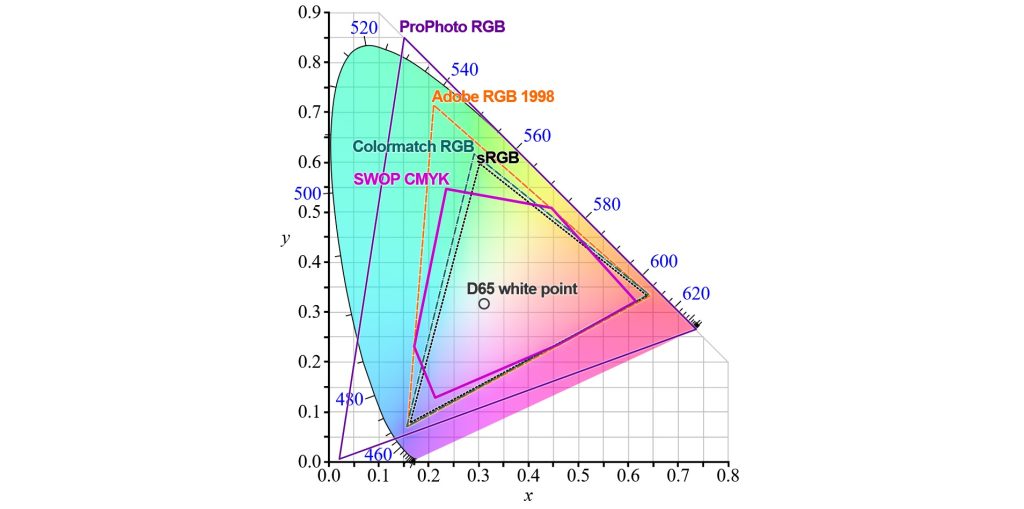
This graphic might seem a little bit confusing at first but when we break it down it becomes easier to understand.
- The coloured area represents the total spectrum of visible light
- Each solid boundary line represents how much of that spectrum can be reproduced
- The white point is a common central point in all the colour spaces
- As we move towards the edge of the spectrum the colours become more saturated
Notice how the majority of colour spaces cannot replicate fully saturated colour of any hue, and ProPhoto RGB can only replicate some fully saturated colours.
If you are looking at an image on a generic monitor you will see colours from within the sRGB range. Some wide gamut monitors can produce colours in the wider RGB ranges – the widest standard is ProPhotoRGB, no monitor can replicate the full ProPhotoRGB gamut as it contains colours outside of the range of human vision.
If you are looking at a CMYK print then you are only seeing colours from within the boundary of the SWOP CMYK colour space. Notice how there are a lot of purple, green and blue/yellow hues that can be produced on a sRGB monitor but not on a CMYK print, and that there are some cyan and aquamarine hues that can be replicated in SWOP CMYK but not in sRGB.
What happens is I print an image from an RGB colour space on a CMYK printer?
When you try to print an image that uses a wider colour palette than CMYK then some kind of colour conversion will have to happen. The easiest way to visualise colour conversion is to draw a line on this spectrum from the colour outside the gamut towards the white point. The colour that will be used is the point where this line intersects the limits of the CMYK colour space.
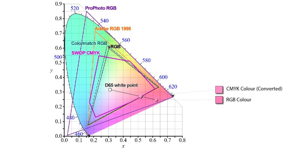
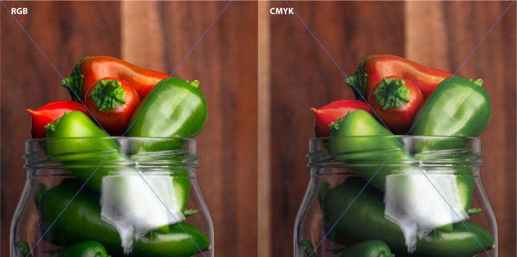
What does conversion mean for an actual image?
Converting a vibrant, saturated RGB image to CMYK will result in some loss of intensity of colour. Some customers can be disappointed by dull, muddy colours in the output
Can I know how my print will look before I send my file?
If you are using Adobe software to create your design you will be able to do a colour proof within the software.
- Select ‘View’ from the top panel
- Select ‘Proof Setup’
- Select a CMYK profile
- Seleck ‘Okay’
- Select ‘View’ from the top panel again
- Enable ‘Colour Proof’
By doing this you will be able to see a representation of your RGB file as a CMYK image. Because the RGB colour space can almost completely replicate the CMYK colour space this should be a relatively accurate representation of how your colours will turn out in print.
What about Pantone?
Pantone colours are made using up to 14 pigments and according to WIkipedia almost 30% of Pantone colours exist outside of the gamut of CMYK printing! That means there is a high likelihood that your Pantone will be subject to colour conversion and the print you receive will not be an exact match to the Pantone you selected.